How To Install a Mobile Theme On Your WordPress Blog, And Why You Should
If you maintain a blog or simple website powered by WordPress and have a good amount of traffic every other day, there are reasons why you should install a dedicated mobile theme on your WordPress blog and serve the same theme to readers, visiting your site from their mobile devices.
 Why Install a Mobile Theme For Your WordPress Blog ?
The first reason is the very obvious one – serving a mobile optimized theme for readers and visitors who arrive on your site from an Android, iPhone, Blackberry or other mobile operating system. Sure, the same readers would be able to see the generic theme of your site on the mobile browser but there are a couple of disadvantages of showing the same generic WordPress theme to both mobile and desktop viewers.
The first disadvantage is that most mobile devices have a small screen space which is not capable to hold the main content without scrolling. Mobile readers will find it very difficult to browse through your site using the desktop theme because they have to zoom in and zoom out again and again to read the content and scroll down/up to navigate through your site.
The second reason is of course the loading time and overall look and feel of your site on mobile devices. Most mobile users use a slow internet connection like GPRS or Wi-fi, so if you are serving that bulky desktop theme to mobile readers, don’t expect the required conversions or a loyal readership.
Find The Average Number of Mobile Readers On Your Site
Before planning to develop a mobile theme for your WordPress blog, login to your web analytics program ( we recommend Google Analytics) and find out the number of visitors arriving on your site via a mobile device, iPhone or Android.
Here are the stats for this site:

You need to go to Visitors > Mobile Devices in Google Analytics and see the stats reports for visitors coming from Android, Blackberry, iPod, iPad and other mobile or tablet devices.
Installing a Mobile Theme On Your WordPress Blog
While you can always write the code for a mobile optimized theme yourself or ask some developer to do it for you, if you’re looking for something really simple – try the Wp-touch WordPress plugin.
WPtouch automatically transforms your WordPress blog into an iPhone application-style theme, complete with Ajax loading articles and effects, when viewed from iPhone, iPod touch, Android, Palm Pre, Samsung touch and BlackBerry Storm/Torch mobile devices. The plugin works out of the box and you should be able to implement the mobile specific design under 10 minutes.
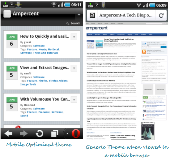
Here is how this blog looks inside a mobile browser, when the mobile theme is active

Once you have installed the Wp-touch mobile optimized theme on your WordPress blog, mobile visitors will see the mobile theme on their Android, Symbian, Blackberry and iOS devices. The plugin loads the recent posts with Ajax and users can quickly toggle between the mobile and generic themes by clicking the “Toggle” button at the bottom of the design view.
The setting panel of Wp-touch lets you add custom codes into the mobile optimized design. For example: you may add Google Adsense ads, custom message and your Google Analytics code into the footer of the mobile specific template. Furthermore, you may also disallow specific categories from the homepage too.
Tracking Mobile Visitors After Mobile Optimized Theme Is Installed
If you have switched to the asynchronous Google analytics code, adding the Analytics code within the settings panel wont track your mobile viewers. This is because the plugin adds the analytics code just before the </body> tag while ideally, the newer Analytics code should be placed before the </head> tag.
In that case, open wp-content/plugins/wp-touch/themes/core/core-header.php and add the newer analytics code before the </head> tag.
Overall, this plugin just saves the day when you want a mobile specific theme for your blog, which is powered by WordPress. And the best thing regarding Wp-touch is that it supports caching plugins e.g W3 Total cache and adds social sharing buttons at the bottom of your posts, out of the box. No manual coding is required at all.
Related reading: Check Your Site’s Mobile Design And Source Code From Desktop Browser
Give this a try and let us know your thoughts in the comments below.
 Why Install a Mobile Theme For Your WordPress Blog ?


A mobile theme is extremely important for any blog that wants to reach the largest possible audience – roughly 25% of searches are on mobile devices and thus it follows that a mobile website blog is a must.