Google’s Advice: Stick With The Default Font Family For Adsense Ads
The appearance and layout of an Adsense ad is one of the several factors that greatly influences its performance. Link color, text color, font size, font type and background color of an Adsense unit must work together or that specific ad unit wont perform according to your expectations. Contextually relevant content is important but placement and appearance of an Adsense ad is critical, as far as click through rate is concerned.
Most Adsense publishers are too lazy to experiment with font types and font sizes, due to the myth that the selection of a font hardly affects its CTR. In general, Adsense publishers choose a specific font style for their Adsense units so that the text on the advertisement completely blends with the font style of their website’s HTML template. This is a safe practice and a good idea; the ads and the content compliment each other but here is another good option worth exploring.
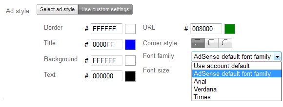
If you are not sure about which font family you should use for an Adsense unit, the Adsense team offers some useful advice – use the default Adsense font family and stick to the default font size.

The Adsense team has rolled out a few improvements on how Adsense ads are shown to users, provided you have selected the default Adsense font family and font size for a specific Ad unit. Google says that their system will now automatically show the best performing font style and font size, which depends on a variety of factors such as operating system of the user, screen resolution, language, size of an ad unit and number of advertisements on any given page. Google says that they have thoroughly tested the new system and the goal of this update is to improve the performance of your ad units, without you having to do anything on your side.
This change will only affect those ad units where you have selected the default Adsense font family and the default Adsense font size. While it is always a good idea to split test ad units and see what works, you should give the default font family another chance to prove its worth.
From my own experiments, I have observed the following trends:
1. Bigger is better: Bigger font sizes always outperform their smaller counterparts. Never shy away to showcase your ad units with large fonts, there is no harm if the text size of your ads appear slightly bigger than the text size of your content.
2. Arial or Verdana, Times is not as good: Arial works great, Verdana is also good but the Times new roman font performs very poorly. The difference is not very large but you will hardly notice any Adsense publisher using the Times font.
3. Cycle: It is a good idea to cycle through your color pallets and change the finer details every 3-4 months. This removes ad blindness for loyal readers who frequently pay a visit to your blog.
I am not very sure how much difference it would make, should you switch to the default Adsense font family for some (if not all) of your Adsense ad units. But using this option would ensure a better user experience as the Adsense system will automatically gauge the visitors reading environment and deliver a matching ad style.
Tip: Improve the performance of Adsense link units.


